

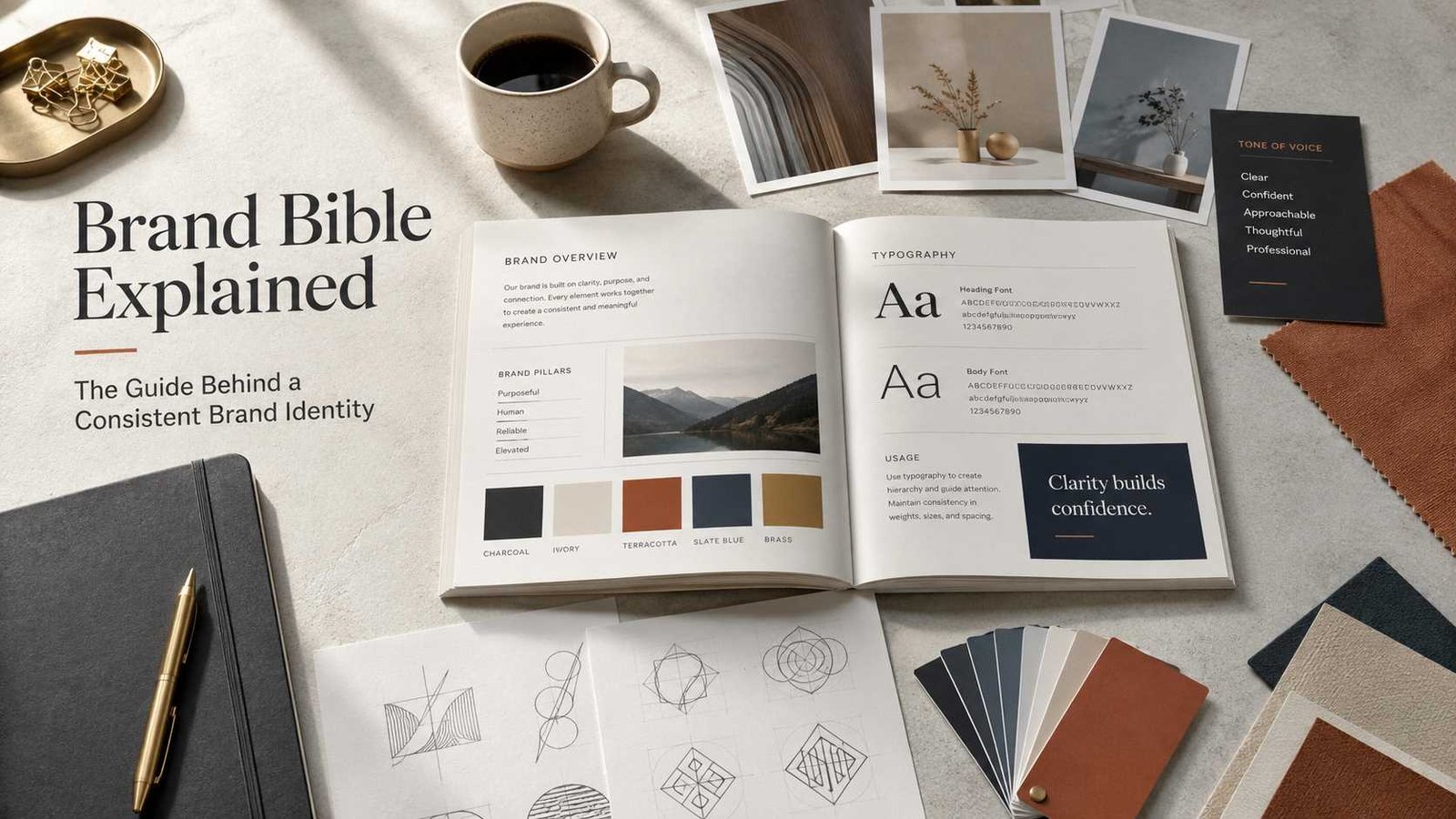
 A brand Bible is a guide that explains how a brand should look, sound, and communicate. It brings the most important rules about a business or organization into one place.
A brand Bible may include the company logo, colors, fonts, photography style, values, voice, tone, key messages, and rules for using all of these elements.
Despite its name, a brand Bible is not a religious Bible or a form of Holy Scripture. The word bible is being used in a common figurative sense to describe an important or authoritative guide on a particular subject. Cambridge Dictionary, for example, recognizes this nonreligious use of the word for a book that provides important information or advice about a subject.
You may also hear a brand Bible called a brand guide, brand guidelines, brand style guide, brand book, brand manual, or brand standards guide.
The exact name matters less than its purpose: helping everyone represent a brand in a clear and consistent way.
What Is a Brand Bible and Why Do Companies Use One?
Imagine that five people are creating material for the same company.
One person designs a website. Another creates social media posts. A third writes emails. Someone else makes product packaging, while an outside agency prepares advertisements.
Without clear rules, each person may make different choices.
One designer might use dark blue. Another might use bright blue.
One writer might sound formal. Another might use jokes and slang.
Someone may stretch the logo, change its color, or place it on a background that makes it difficult to see.
Soon, the company no longer looks or sounds like one brand.
A brand Bible helps prevent this problem.
It becomes a central reference that tells people:
- How the logo should be used
- Which colors belong to the brand
- Which fonts should appear in designs
- What type of photographs or illustrations fit the brand
- How the company should speak to customers
- Which words and messages best represent it
- What the organization values
- What should not be done with its visual identity
Adobe describes brand style guides as a way to keep brand identity consistent, with guidelines that can cover areas ranging from typography to brand voice.
Canva’s Brand Kit similarly brings items such as fonts, logos, colors, icons, imagery, graphics, and templates together so they can be used consistently.
So the simplest definition is this:
A brand Bible is a document that records the rules for how a brand looks, speaks, and presents itself.
It helps different people make decisions that still feel as if they came from the same organization.
What Is Another Name for a Brand Bible?
There is no single name that every company uses.
Another name for a brand Bible may be:
- Brand guidelines
- Brand style guide
- Brand book
- Brand manual
- Brand identity guide
- Brand standards
- Corporate identity manual
- Visual identity guide
These terms often overlap, but they do not always mean exactly the same thing.
A visual identity guide, for example, may focus mainly on appearance. It could explain logos, fonts, colors, icons, and photography.
A more complete brand Bible may go further. It can include the company’s purpose, values, audience, personality, voice, tone, positioning, and major messages.
A small organization may call a ten-page document its brand guide.
A large organization may have dozens or even hundreds of pages of standards.
There is no required length.
What matters is whether the guide gives people enough information to represent the brand correctly.
What Should a Brand Bible Contain?
A good brand Bible answers a simple question:
If someone who has never worked with this brand before opens this guide, will they understand how the brand should be presented?
The answer should be yes.
Some guides are mainly visual. Others cover communication in much greater depth.
Adobe notes that a comprehensive brand style guide may include elements such as typography, color palette, tone of voice, and mission.
That shows why there is no single fixed list that every brand must follow.
However, seven broad elements give us a useful way to understand what a strong brand Bible often contains.
What Are the 7 Brand Elements?
People sometimes search for the 7 brand elements, but there is no universal authority that says every brand must have exactly seven.
Different companies and branding professionals organize their guidelines in different ways.
Still, the following seven elements provide a practical framework.
1. Brand Purpose and Values
Before choosing colors or fonts, a company should understand who it is.
The purpose section may answer questions such as:
- Why does this organization exist?
- Who does it serve?
- What problem does it solve?
- What does it believe is important?
- What principles guide its decisions?
For example, a family-owned bakery may value warmth, simplicity, local community, and handmade quality.
A financial technology company may value clarity, security, speed, and trust.
Those values should influence more than a page in a document. They should help shape the way the company communicates.
A cheerful children’s brand should probably not sound cold and legalistic.
A serious medical organization should probably not communicate in the same way as a comedy entertainment company.
Purpose gives direction to everything else.
2. Logo and Visual Marks
The logo is often one of the most recognizable parts of a brand.
A brand Bible normally shows:
- The main logo
- Alternate logo versions
- Horizontal or vertical versions
- Approved colors
- Minimum sizes
- Space that should remain around the logo
- Backgrounds on which the logo may appear
- Incorrect ways to use the logo
The incorrect examples can be surprisingly useful.
They may show people not to:
- Stretch the logo
- Rotate it
- Change its proportions
- Add shadows
- Replace its colors
- Place it on a busy background
- Add words that are not part of the design
Clear rules protect the identity from slowly changing as different people use it.
NASA provides a strong real-world example. Its official brand guidance sets standards for the use of its insignia, logotype, and supporting graphics. NASA says the goal of its Graphics Standards Manual is to establish a clear and consistent visual identity.
3. Color Palette
Color can make a brand recognizable even before someone reads its name.
A brand Bible may list:
- Primary colors
- Secondary colors
- Accent colors
- Background colors
- Digital color values
- Print color values
- Approved combinations
Simply writing “blue” is usually not enough.
There are thousands of shades of blue.
A proper guide gives exact color specifications so the website designer, packaging printer, and social media team can reproduce the intended color as closely as possible.
Consistency matters.
If a brand uses pale green one day, dark green the next, and bright neon green a week later without any clear reason, the identity can start to feel disconnected.
4. Typography
Typography means the way written text is visually presented.
It includes the fonts used for:
- Headlines
- Subheadings
- Paragraphs
- Buttons
- Captions
- Quotes
- Printed materials
Adobe describes typography as involving the selection and arrangement of type so text is readable and visually effective.
A brand might choose one font for large headings and another for body text.
The brand Bible can also explain:
- Font sizes
- Font weights
- Capitalization
- Line spacing
- Heading hierarchy
- When bold or italic text should be used
These details may seem small, but repeated visual choices help people recognize a brand.
5. Imagery and Visual Style
Images communicate mood very quickly.
A luxury hotel may use spacious, carefully composed photographs.
A children’s company may prefer bright, playful illustrations.
An outdoor company may show wide natural landscapes and active people.
A brand Bible can explain what type of imagery fits the organization.
It may provide guidance for:
- Photography
- Illustrations
- Icons
- Graphics
- Image filters
- Cropping
- Backgrounds
- Lighting
- Composition
Canva includes imagery, icons, graphics, logos, fonts, and colors among the kinds of assets that can be organized within a brand system.
The goal is not to make every picture identical. It is to help different images feel as though they belong to the same family.
6. Brand Voice and Tone
A brand does not only have a look.
It also has a voice.
Brand voice is the general personality behind the words a company uses.
A brand might sound:
- Friendly
- Calm
- Expert
- Bold
- Formal
- Playful
- Caring
- Practical
Tone is slightly different.
The voice can remain recognizable while the tone changes according to the situation.
Mailchimp explains this difference clearly: a person keeps the same basic voice but may use a different tone in different situations.
Think about an airline.
Its cheerful advertisement about a holiday destination can sound warm and exciting.
But a message telling passengers that a flight has been cancelled needs a more serious and helpful tone.
It is still the same company.
The situation has changed.
A strong brand Bible may give examples such as:
We are:
Friendly, clear, knowledgeable.
We are not:
Sarcastic, confusing, or arrogant.
Examples like these can be more useful than simply telling writers to “follow our tone.”
7. Messaging and Tagline
The final element is what the brand wants people to understand and remember.
Messaging can include:
- The main brand promise
- A tagline
- Short descriptions of the company
- Product descriptions
- Important benefits
- Positioning statements
- Approved claims
- Preferred terminology
For example, imagine a fictional company that repairs bicycles.
Its message might focus on:
Fast, trustworthy repairs that keep your everyday bike on the road.
That central idea could influence the website, advertisements, shop signs, emails, and social media.
The exact words do not always have to be repeated.
The meaning should remain consistent.
Can You Provide an Example of a Brand Bible?
Yes.
One useful real-world example of detailed brand standards comes from NASA.
NASA has an official Graphics Standards Manual and current brand guidance covering its insignia, logotype, and supporting graphics. Its guidance exists to help maintain a consistent visual identity.
It would not be accurate to claim that NASA officially calls its manual a “brand Bible.” It does not need to use that informal term for the example to be useful.
The principle is the same: document the rules so people know how important identity elements should be used.
Here is an easier fictional example.
A Simple Brand Bible Example
Imagine a small company called Cedar & Stone Coffee.
Its brand Bible could look like this:
| Brand Element | Cedar & Stone Coffee Example |
|---|---|
| Purpose | Create welcoming neighborhood spaces around good coffee |
| Values | Community, quality, warmth, simplicity |
| Main Colors | Forest green, warm cream, natural brown |
| Logo | Simple tree-and-cup mark |
| Typography | Serif font for headings, clean sans-serif for body text |
| Photography | Natural light, real customers, wood and warm interiors |
| Voice | Friendly, calm, informed |
| Main Message | Good coffee brings people together |
The document could then give more detailed instructions.
For photography:
“Use warm, natural photographs that feel real. Avoid heavily edited or artificial-looking images.”
For writing:
“Speak like a knowledgeable neighbor. Explain coffee clearly without making beginners feel foolish.”
For the logo:
“Keep clear space around the mark. Do not stretch, tilt, recolor, or add effects.”
Now a designer, photographer, writer, or new employee has something practical to follow.
That is the value of a brand Bible.
How to Create a Brand Bible
Creating a brand Bible does not begin with opening a design program.
It begins with understanding the brand itself.
Step 1: Define Your Brand Purpose
Write down why the organization exists.
Ask:
Who are we helping?
What do we provide?
What do we want people to remember about us?
What values should guide our work?
Keep the answers simple.
If a company cannot explain its identity clearly to its own team, it will struggle to communicate clearly with customers.
Step 2: Understand Your Audience
A brand does not communicate in isolation.
It speaks to people.
Think about:
- Who usually buys from you
- What they need
- What problems they face
- What language they understand
- What makes them trust a company
- What matters most when they choose between alternatives
A brand aimed at young children will communicate differently from one serving corporate accountants.
Neither approach is automatically better.
It must fit the audience.
Step 3: Document Your Logo
Place all approved versions in one section.
Include clear instructions for:
- Size
- Spacing
- Colors
- Placement
- Backgrounds
Also show a few examples of improper use.
This prevents people from guessing.
Step 4: Build Your Color Palette
Choose the colors that belong to the brand and record their exact values.
Divide them into groups if necessary:
Primary colors: the colors used most often.
Secondary colors: supporting colors.
Accent colors: colors used sparingly for emphasis.
Do not create dozens of colors simply because you can.
The guide should make decisions easier, not harder.
Step 5: Choose Typography
Select the fonts that represent the brand well and remain easy to read.
Then define how they should be used.
For example:
Heading font: used for titles and major headings.
Body font: used for paragraphs and longer text.
Accent font: used only in limited situations.
Explain size and hierarchy where useful.
Step 6: Define the Image Style
Collect several photographs, illustrations, or graphics that show the desired direction.
Then explain why those examples fit.
Instead of writing:
“Use nice pictures.”
Write something useful:
“Choose photographs with natural light, uncluttered backgrounds, and real human expressions. Avoid exaggerated poses and heavy color effects.”
Specific guidance helps people make better decisions.
Step 7: Write the Brand Voice
Imagine the brand as a person.
How would that person speak?
Choose three to five qualities.
For example:
Clear, practical, warm, confident.
Then explain what those words mean.
You could write:
“We explain difficult ideas in plain language.”
“We sound confident without talking down to people.”
“We use warmth without becoming overly casual.”
Mailchimp’s own content guidance offers a useful example of this kind of system. It defines qualities for its voice while explaining that tone changes with context.
Step 8: Create Messaging Rules
Write the basic messages people need to communicate.
These may include:
- What the company does
- Who it serves
- Why it is different
- Main customer benefits
- Tagline
- Short company description
- Longer company description
The goal is not to force every employee to repeat identical sentences.
It is to keep the central meaning consistent.
Step 9: Add Real Examples
Rules become much clearer when people can see them.
Show:
- A correct social post
- A correct advertisement
- A correct email
- Correct logo placement
- Correct photography
- Incorrect examples
People often learn faster from examples than from abstract instructions.
Step 10: Keep the Brand Bible Accessible
A beautiful guide is useless if nobody can find it.
Store it somewhere employees and approved partners can easily access.
It may be:
- A PDF
- An online document
- A shared company resource
- A digital brand portal
- Part of a design system
The format can change.
The important thing is having one dependable source of guidance.
Step 11: Review It as the Brand Changes
A brand guide should provide stability, but it should not become frozen forever.
Businesses change.
Products change.
Audiences change.
Websites and communication channels change.
Review the guide from time to time and update it when there is a real reason.
Do not change important elements every few weeks simply because a new style becomes popular.
Consistency is one of the main reasons the guide exists.
Is a Brand Bible the Same as a Brand Style Guide?
Often, yes.
People sometimes use brand Bible and brand style guide to describe nearly the same thing.
But there can be a difference in scope.
A style guide may focus mainly on:
- Logo
- Colors
- Typography
- Images
- Layout
A broader brand Bible may also include:
- Mission
- Purpose
- Values
- Audience
- Personality
- Voice
- Messaging
- Positioning
There is no universal naming system.
If one company calls a document its “brand book” and another calls a similar document its “brand Bible,” that does not mean they follow completely different systems.
Look at what the document contains rather than relying only on its title.
Why Is It Called a Brand “Bible”?
This question matters, especially on a site devoted to understanding biblical terms.
The word Bible, with a capital B, normally refers to sacred Scripture in Christian use.
But English also uses the word bible figuratively.
Cambridge Dictionary includes a nonreligious meaning in which a bible can refer to a book giving important information or advice about a particular subject.
That is the sense being used in the phrase brand Bible.
It means something like:
the main authoritative guide for the brand.
It does not mean that the branding document is sacred Scripture.
It is not another Bible translation.
It is not a religious book.
It is not part of Christian doctrine.
Understanding that distinction prevents a great deal of confusion.
Readers interested in the religious use of the word may also want to explore what is the meaning of Bible and what kind of book is the Bible, two related topics in our Bible study library.
How a Brand Bible Differs From an Actual Bible Study Resource
Because the name can be confusing, it helps to compare a few terms.
| Resource | Purpose |
|---|---|
| Brand Bible | Sets rules for a company’s identity and communication |
| Reference Bible | Helps readers connect related Scripture passages |
| Bible Commentary | Provides explanations of biblical passages |
| Bible Concordance | Helps readers locate words and passages in Scripture |
| Bible Theology | Studies themes and teachings found throughout Scripture |
A reference Bible, for example, remains a Bible and normally includes tools that connect one biblical passage with another.
A Bible commentary is a separate study resource that explains biblical texts.
A Bible concordance helps people search for words or passages.
These are completely different from a business brand Bible.
If you are learning about Bible study tools, our guides to what is a reference Bible, what is a Bible commentary, what is a Bible concordance, and what is Bible theology explain those subjects in greater detail.
The similarity is mostly in the word being used.
Their purposes are very different.
What Makes a Good Brand Bible?
A good brand Bible does not need to be huge.
It needs to be useful.
Several qualities matter.
It Is Clear
People should understand the instructions without needing a designer to translate them.
Avoid unnecessary technical language.
It Is Specific
“Use our colors correctly” is vague.
“Use these approved color values for digital and print work” is useful.
It Shows Examples
A visual example can quickly explain what several paragraphs struggle to describe.
It Covers Both Words and Images
Modern brands communicate through more than logos.
A customer may meet a company through an email before seeing its packaging.
Voice matters.
Tone matters.
Words matter.
It Can Be Used by Different People
A designer, writer, employee, agency, photographer, and marketing partner should all be able to find the guidance that applies to them.
It Protects Consistency Without Killing Creativity
A brand Bible should create boundaries, not make every piece of communication identical.
Think of it like rules for a sport.
The rules create a shared structure, but many different plays can still happen inside that structure.
Good brand guidelines work in a similar way.
They provide recognizable limits while leaving room for thoughtful creativity.
Do Small Businesses Need a Brand Bible?
A small business may not need a hundred-page manual.
But it can still benefit from basic brand guidelines.
Even a simple document covering:
- Logo
- Colors
- Fonts
- Photo style
- Voice
- Core message
can save time.
Suppose a local business hires a freelancer to create a brochure.
Without guidelines, the owner may spend hours explaining basic design choices.
With a clear brand guide, the freelancer already knows what colors, fonts, logo versions, image style, and tone to use.
The guide becomes more valuable as additional people become involved.
Does a Personal Brand Need One?
It can.
Authors, speakers, consultants, creators, and public professionals may also build recognizable brands.
A personal brand guide might include:
- Name presentation
- Profile photographs
- Colors
- Fonts
- Writing voice
- Biography
- Main areas of expertise
- Website style
- Social media appearance
The guide may be much shorter than a large corporate manual.
The principle remains the same: make important identity decisions once and apply them consistently.
Can a Brand Bible Change?
Yes.
A brand Bible is a guide, not a document that can never be updated.
Organizations sometimes refresh their logos, colors, websites, messaging, or positioning.
When a genuine brand change happens, the guide should change too.
NASA’s continuing Brand Center is a useful example of how organizational identity guidance can remain an active resource rather than merely a historical document. Its current guidance continues to provide rules for the agency’s insignia, logotype, and supporting graphics.
The key is balance.
Changing a brand too often creates confusion.
Never changing it can allow guidance to become outdated.
A useful brand Bible gives people a dependable standard while still allowing thoughtful updates when needed.
Understanding the Difference Protects the Meaning of Both
So, what is a brand Bible?
A brand Bible is a central guide that explains how a brand should look, sound, and communicate.
It may contain the brand’s purpose, values, logo rules, colors, typography, imagery, voice, tone, and messaging.
You may also hear it called a brand guide, brand book, brand manual, or brand style guide.
There is no universal rule saying every brand Bible must contain exactly seven elements. The seven-part framework we covered provides a practical way to organize the most common areas, while real brand guidelines vary according to the organization. Adobe and Canva, for example, describe overlapping sets of visual and communication elements rather than one fixed seven-part standard.
Most importantly, the phrase should not be confused with the Holy Bible.
In “brand Bible,” the word is being used figuratively for an important or authoritative reference guide.
For Christians, the Bible has a far deeper meaning as sacred Scripture. A company’s branding document is simply a business tool.
Knowing the difference helps us use both terms clearly and respectfully.
If you would like to understand the biblical side more deeply, you can continue with What Is the Meaning of Bible? or What Is a Reference Bible? These explain what the Bible itself is and how genuine Bible study resources are used.

Dr. Rachel is very smart and knows a lot about the Bible. He helps us understand the Bible better by talking about the old texts in a simple way.